Wearable Spring Colors: Easy Outfit Formulas & Confidence
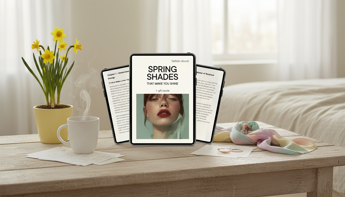
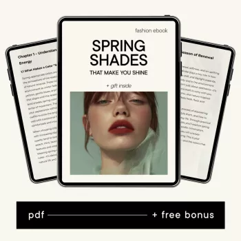
Spring Shades That Make You Shine: A Digital Guide to Color Confidence and an Easy Spring Wardrobe
Color can do more than brighten an outfit—it can make getting dressed faster, elevate basics, and help personal style feel intentional. This season, the goal isn’t to chase every new hue; it’s to find spring shades that feel wearable, flattering, and easy to repeat. The Spring Shades That Make You Shine – Digital Download Guide for Color Confidence & Stylish Spring Wardrobe is built for real-life closets: denim, neutrals, a few go-to shoes, and a schedule that doesn’t leave time for outfit overthinking. For more guidance, see How Every Season Can Dress For Spring – Created Colorful.
What “color confidence” looks like in real life
Color confidence isn’t about being the loudest in the room. It’s the quiet certainty of knowing what works and repeating it on purpose. For further reading, see Light Spring Color Palette: Complete Guide | Curate Your Style.
- Choosing colors that flatter your skin tone and feel like “you,” rather than chasing every trend
- Building outfits around one clear focal color and keeping the rest calm and cohesive
- Using repeatable formulas so favorite shades show up often—without buying a whole new wardrobe
- Learning to spot the difference between a shade that energizes vs. one that drains (lighting and fabric matter)
- Treating color as a tool: polish for work, freshness for weekends, and ease for everyday errands
If a color makes your face look clearer, your eyes look brighter, and your outfit feel “finished” without extra effort, that’s confidence you can rely on.
How the digital guide helps streamline spring style
Spring outfits can get tricky: mornings are chilly, afternoons warm up, and it’s easy to default to the same neutrals. A quick-reference guide creates structure—so color becomes simple instead of stressful.
- A practical approach to picking spring-appropriate shades that look bright without feeling loud
- Mix-and-match strategies for outfits that read fresh, clean, and put-together
- Wardrobe-friendly guidance that works with denim, neutrals, and the staples already in rotation
- Styling prompts that reduce decision fatigue when planning outfits for the week
- A format designed for quick reference—open on a phone or tablet while getting dressed or shopping
For extra context on how color affects perception and mood, it can help to skim research-driven overviews like Verywell Mind’s guide to color psychology—then bring those insights back to your own closet in a grounded, wearable way.
Spring shade families and what they do for an outfit
Instead of thinking “I need more color,” it’s easier to choose a shade family and apply it consistently. Each family has a different vibe—and a different learning curve.
- Soft pastels: create an airy look and pair easily with light neutrals and denim
- Clear brights: add energy; best used as a single statement piece with grounding basics
- Fresh greens and blues: feel crisp and modern; ideal for casual layers and office staples
- Warm corals and sunny tones: bring warmth to the face; great for tops, scarves, and accessories
- Updated neutrals: cream, tan, and light gray make bold shades more wearable and cohesive
Quick Pairing Guide for Wearable Spring Color Combos
| Shade family | Best as | Easy pairings | Style effect |
|---|---|---|---|
| Soft pastels (blush, lilac, mint) | Top or knit | White denim, light-wash jeans, cream trench | Light, romantic, approachable |
| Clear brights (cobalt, fuchsia, tangerine) | Statement piece | Black trousers, mid-wash denim, crisp white shirt | Bold, modern, high-impact |
| Fresh greens/blues (sage, seafoam, sky) | Layering piece | Taupe, navy, chambray, gold jewelry | Clean, calm, polished |
| Warm corals/yellows (coral, apricot, butter) | Accessory or blouse | Denim, camel, soft gray, raffia textures | Sunny, friendly, uplifting |
| Spring neutrals (cream, stone, light gray) | Base outfit | Any accent color, especially brights | Cohesive, elevated, effortless |
Looking for trend context without letting trends run the show? The Pantone Color of the Year is a useful reference point—then you can translate that inspiration into shades that actually suit your wardrobe and undertone.
A simple method to find shades that flatter
Outfit formulas that make spring color feel effortless
These are the kinds of mix-and-match rules that the Spring Shades That Make You Shine – Digital Download Guide for Color Confidence & Stylish Spring Wardrobe is designed to keep at your fingertips—especially on rushed mornings.
Building a stylish spring wardrobe without overbuying
If you enjoy digital guides that make everyday routines feel simpler (style, home, or beyond), you may also like AI Insights for a Healthier Cat: Ultimate eBook Guide for Cat Health Monitoring with AI Tools and Techniques—another practical download built for quick reference.
Using the digital download in everyday life
Who this guide is especially helpful for
Get the download
- Spring Shades That Make You Shine – Digital Download Guide for Color Confidence & Stylish Spring Wardrobe
- Instant-access digital format designed for quick reference while getting dressed or shopping
- A structured way to choose spring shades, combine outfits, and build a cohesive seasonal look
FAQ
How do the right spring colors make an outfit look more flattering?
Flattering spring shades reflect light toward the face, which can make skin look more even and features look clearer. Undertone, contrast level, and fabric finish all matter—soft matte pastels read gentler, while glossy or ultra-clear brights create stronger impact.
What if bright spring colors feel intimidating?
Start small with accessories or one bright piece paired with steady neutrals like denim, cream, or black. You can also try a softer version of the color (like butter instead of neon yellow) and repeat it in a second small detail to make the look feel cohesive.
Can a small wardrobe still look colorful in spring?
Yes—choose 2–3 accent colors, use spring-friendly neutrals as your base, and rely on a few outfit formulas to remix pieces. When each colored item works with multiple bottoms and layers, a small wardrobe can look intentionally colorful without extra buying.










Leave a comment